


Don't design for yourself, design for your users
How to make Doshy useful to potential users when it was originally established on the client's own needs?
Team
2 UX Designers
Duration
3 weeks
My Roles
Client communication
Project management
Usability testing
Concept development
Interface design
Documentation
Methods
Business analysis
Heuristic evaluation
User interviews
Usability testing
Survey
Competitive & comparative analysis
Affinity Mapping
Cost vs impact analysis
Prototyping
Tools
Miro
Figma
Zoom
Slack
Google Suite
1-minute summary

Brief
Doshy is an app to help Australians manage their bills in one place. The concept was driven by the client's own needs and assumptions. Yet, the functionality of features in the MVP has not been tested. Our client would like us to provide a list of suggestions to improve the user experience of the current MVP before its official launch.

Research insights
By conducting usability testing, we found that the current prototype was usable, yet not useful. It did not provide enough features to satisfy early adopters. For instance, making direct payment through the app which is one of the key features was missing entirely. Automation in uploading the bills, another key feature, was very cumbersome to set up. The current "MVP" was not a good "MVP" to allow users to provide meaningful feedback for future development.

How did Doshy work before?

Recommendations
We suggest adding 3 cost-effective features to improve the chance of success of the current MVP and provide the total experience of Doshy to users.
-
Adding bills manually
-
Setting up email auto-forwarding by a step-by-step instructional video
-
Paying the bills by connecting to the third-party payment website
By adding the above features, our client would be able to get more meaningful feedback on the whole concept of Doshy in the testing phase.
What have we done to improve the user experience?

Full case study

The challenge
Doshy was introduced with the mission to empower individuals to feel confident about their finances and in control of their spending by consolidating and paying their bills with a convenient and easy-to-understand app.
“I would like your help in improving the user experience of the current MVP.”
Our client would like us to provide a list of suggestions to improve the user experience of the current MVP before its official launch. The first question we needed to ask - what makes up a good user experience? We introduced the UX honeycomb to our client. There were 7 essential considerations in order to create a good user experience and we needed to find a sweet spot between these various areas. The UX honeycomb provided us with a direction for this project and ensured that we and our client had the same metric to evaluate the current MVP.


Evaluation of the current MVP
The current prototype was usable.
The concept of Doshy was driven by the client’s own needs and unverified assumptions. The client has not tested the concept with potentials users before. Thus, we first looked into the interface design of the current prototype. We found the interface usable according to the usability principles. This is also backed up by the feedback we collected in usability testing with 5 users. They all commented that the interface design was simple and clean. They could complete the required tasks.
Usable yet not useful.
During the usability testing, we found that users were not excited about this app. Users perceived Doshy as a bill reminder app since the direct payment feature was missing entirely. Also, users found the automation in uploading the bills to the app was very cumbersome to set up.
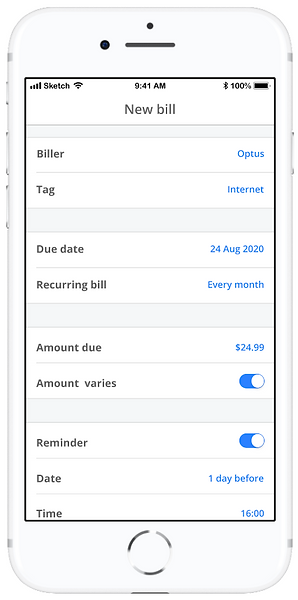
How it works:

Key findings from usability testing:
-
Users did not want to finish the sign-up process since it was too long.
-
The phone call to set up the email auto-forwarding was considered as a roadblock.
-
Most of the users settled bills by direct debit and through the bank apps, they found the functionality of the current could offer more.

The problem
The features of Doshy’ current MVP were too minimal to call it a MVP.
A MVP is the product with just enough pieces of functionality to satisfy early users and gather feedback for future improvement. Imagine that your users need to move from point A to point B, a wheel has no value to them but a skateboard does. It’s all about transport not concepts to the user. Even when you are stripping down your product’s planned development to MVP levels, you still need to keep in mind the total user experience, and you need to make sure that whatever functionality you include fully solves a problem for the user.

We needed a way to make the current MVP more “viable” so that they could get more meaningful feedback in the testing phase.

The design
Design strategies:
-
Make the prototype get closer to the ultimate goal.
-
Differentiate Doshy from competitors.
-
Add features that users find useful.
Since the MVP would only test with 50-100 users, we did not want our client to invest a large amount of money before he proves the concept. Thus, the suggestions below were the cost-effective solutions that tried to improve the chance of success in the MVP.
#1: Add bills manually
Users reflected in the usability testing that not all their bills come in their email. They still receive paper bills, such as rent, which will need a way to manage these bills as well. Allowing users to input their bills manually is an essential feature to enable users to manage ALL the bills in one place. This feature will get Doshy to achieve its vision.

#2: Instructions of email auto-forwarding to replace the phone call
The phone call for setting up email auto-forwarding was a roadblock to users as reflected during the usability testing. The MVP became so hand-operated because of the phone call. It is necessary to get rid of it by a step-by-step instructional video. We believe this is only a temporary expedient for the MVP due to budget constraints.
In the long term, Doshy will need to consider some other possibilities for automation in uploading bills. For instance, a partnership with billers to directly deliver the bills to Doshy.

#3: A “pay now” button with payment URL
When users received a reminder from Doshy, they were not only able to view the bill details but also able to click the pay button to the payment website and complete the process. It would remove the hassle and save the user's time to go back to the emails and look for the payment method.
The feature will differentiate Doshy from the competitors in bill reminder apps. It will also make MVP get closer to the ultimate goal of Doshy which is paying through the app.
In the long term, Doshy will need to consider other possibilities to pay directly through the app.
Design system

Test results
In the second round of usability testing, users found the new features clear and the MVP made more sense to them because it provided the user with a complete solution. So the modified MVP kind of solved a problem for users who wanted to have a one-stop platform for managing bills. However, the MVP did not delight users because there were already lots of other solutions just like Doshy, such as their banking apps, etc.
Doshy in fact needed solid groundwork.
The more potential users we talked to in this project, the more we thought Doshy needed more research and a unique market selling point for now as there were many similar apps existing in the market. You cannot release an unimpressive, minimally useful product and expect to find a loyal user base eager for your next version. How many chances do you think you will have to re-introduce your product to users if it doesn’t wow them the first time?
The concept of Doshy would be more solid if our client could...
-
Identify specific target users
-
Find a niche in the market
-
Avoid direct competition with banks
We believe by taking a step back to redefine the problem of people paying the bills or managing their finances and exploring the solution space, it could ensure Doshy heading to a positive direction.


Learnings
Acknowledge your findings
When we talked to users, we felt like Doshy might not be the app that users needed. We found users could not resonate with the assumptions in paying bills that were addressed by the client. We needed to acknowledge our findings, honestly reflected them to our client and let the data lead us in the right design direction.
You are the UX expert in the room!
Sometimes we will do thoughtlessly what clients say because they know more about the business. But be aware that you know more about UX than they do! You should always refer to the research data and tell your client what your potential users actually need with the support of data. Anyway, do not let clients lead the design direction by telling you what they want!